To reiterate, I really dislike this flyer.
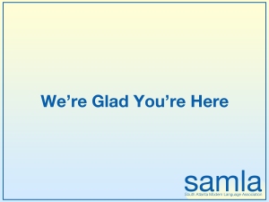
After a long internal debate about what would be the best way to revise it, I gave in to my minimalist tendencies and came up with this.
I know what you’re thinking. “Ha ha what the heck is this, Andrew?” It’s a deconstructed version of the original flyer.
I started by changing the font of the SAMLA logo. In my version “samla” is in Helvetica, with the acronym spelled out in Helvetica Light. I think it looks much cleaner and more professional than whatever font it was in before. I also removed the wave thing.
The coffee cup was originally intended to stay in the composition, but I decided it was unnecessary and the flyer actually looked better without an image. SAMLA is an organization that is interested in words. So I gave them words.
As you can see, I got rid of “SAMLA welcomes all first-time conference attendees.” It is redundant. Of course SAMLA welcomes all first-time conference attendees. And hopefully they welcome returning conference attendees as well. This sentence seemed superfluous to me.
So that leaves us with “We’re Glad You’re Here.” I think it gets the message across just fine. And in this context, it doesn’t discriminate against returning conference attendees. I removed the punctuation in the sentence as well because minimalism. It’s also centered.
Regarding color, I kept the “SAMLA blue” because it’s actually a nice color. I made the background a gradient. It’s opposite of the gradient used in the logo.


